How about this for a rebound after a rather quiet second half of last year? A massive change of game plan sees HTC focus on a few special products instead of trying to create a smartphone for every taste. An outstanding result of this effort, the HTC One X brings so many firsts for both company and industry, that a climb to the top of the food chain may be a walk in the park.


HTC One X official photos
Just look at some of the things the One X has put on its resume. The 4-PLUS-1 Tegra 3 makes its smartphone debut here, the awesome polycarbonate body adds that extra solid feel and grip, while the 4.7" second-generation S-LCD of HD resolution on the front is a crystal-clear view to the world of Sense 4.0 and Android 4.0 ICS.
And that's just the HTC One X getting started, check out the complete list below.
Key features
- Quad-band GSM and dual-band 3G support
- 21 Mbps HSDPA and 5.76 Mbps HSUPA
- 4.7" 16M-color Super LCD 2 capacitive touchscreen of HD resolution (720 x 1280 pixels); Gorilla glass
- Android 4.0.3 Ice Cream Sandwich with latest HTC Sense 4.0
- 1.5 GHz quad-core Cortex-A9 CPUs, low-power companion core, ULP GeForce 2 GPU, Nvidia Tegra 3 chipset
- 1 GB of RAM and 32 GB of storage
- 8 MP autofocus camera with LED flash; face detection and geotagging
- 1080p and 720p video recording @ 30fps with stereo sound
- 720p front-facing camera for video-chat
- Wi-Fi b/g/n and DLNA
- GPS with A-GPS
- Stereo FM radio with RDS
- Accelerometer, proximity sensor and auto-brightness sensor
- Standard 3.5 mm audio jack
- microUSB port (charging) and stereo Bluetooth v4.0
- MHL TV-out (requires MHL-to-HDMI adapter)
- Smart dialing, voice dialing
- DivX/XviD video support
- HTC Locations app
- HTCSense.com integration
- HTC Portable Hotspot
- Office document editor
- Beats audio enhancements
Main disadvantages
- No microSD card slot, no alternative options in terms of storage
- MicroSIM support only
- Incapable of 3G video calls without a 3rd party app
- No dedicated camera key
- Non-user-accessible battery
- Uninspiring image and video quality, video framing is tricky
Previous HTC flagships were often criticized for lacking identity and bringing little improvement in terms of both features and design. This time critics should have little to fret about - the One X is as bold a step forward as it gets. Not only is the processing power more than doubled, but the screen and body of the smartphone itself are immensely better than what the Sensation and Sensation XE had to offer. And let's not forget the camera, which HTC say is the best they have ever made.
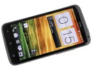
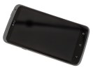

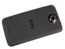
HTC One X live shots
What we're particularly impressed with about the One X is that it's actually more compact than you'd expect from a phone with a 4.7" screen. Not only is it impressively slim, the One X is only marginally larger than the omnipresent Samsung Galaxy S II and that one had a 4.3" screen.
There's not much going on inside the eco-friendly box
Starting with the One X, HTC are moving away from the plain paper packaging of its older smartphones in favor of a new kind of foam box with rounded edges, that's wrapped in a paper sleeve made of 100% recyclable and biodegradable materials. The labels were reportedly printed with environmentally friendly soy ink, so the company is obviously trying hard to show that it cares.
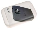
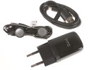
The retail package is pretty modest
Sadly, the contents of the box are not even nearly as special as its shape and finish. There's a pair of cheapish-looking headphones inside, and the usual charger/data-cable combo. Given the One X has no microSD slot, we couldn't have expected a memory card inside, but there are no Beats headphones either.
The supplied headset is pretty basic and it turns out the Beats audio logo on the back of the One X here only stands for the software tweaks, which the smartphone got. The final item in the box is the pin required for extracting the microSIM tray. By the looks of it, the One X's retail package is a step backwards from the one of the Sensation XE.
HTC One X 360-degree spin
The brilliant use of space is one of the best things about the HTC One X. It's not that the smartphone is tiny, you'd hardly call it a compact set. But at 134.4 x 69.9 x 8.9 mm it's merely 3.8mm wider and less than a cm longer than the Galaxy S II, which only has a 4.3" screen.
Basically, you are gaining 0.4" (1.02cm) of extra screen diagonal for very little extra body fat, so HTC deserves credit for that. Keeping the waistline nicely slim is also quite a feat, as large-screen smartphones are quite sensitive to such things.

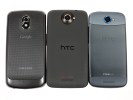
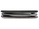
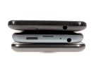
The HTC One X sized up against the Samsung Galaxy Nexus and the HTC One S
Design and construction
If you look carefully, the HTC One X design isn't too different from that of its predecessors. The lines are basically the same and the elements are distributed in much the same way around the smartphone's body.
However, there's no chance of mistaking that the One X is a generation newer than the Sensation XE. The notably slimmer profile and the polycarbonate unibody really take the general feel up a notch. And that's not even the only benefit of the new material used - the shell of the One X is non-painted much like the one on the Nokia N9 and Lumia 800/900, so it should be able to mask potential scratches quite well.
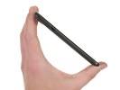
The low overall weight is another huge advantage of the polycarbonate body. At 130g, the One X is impressively lightweight for its size and that's one of the first things you'll notice when handling it.
The main attraction on the HTC One X front is of course its 4.7" HD Super LCD2. The second generation of Super LCDs is actually a huge step forward from the previous versions and we are not just talking resolution here.

The HD Super LCD2 is gorgeous to behold
The One X display offers arguably the best image quality of any LCD on the market. Not only is it remarkably sharp (at about 312 ppi, it's virtually impossible to distinguish individual pixels), but also has great contrast and nicely saturated colors.
As you can see in the table below, the screen is pretty bright as well and its viewing angles are splendid - the icons look almost as if they are painted on the screen. The blacks aren't as deep as those of the AMOLEDs out there, but still great in LCD terms. Sunlight legibility is close behind the market best, which is good enough to not cause any usability issues. Overall, the One X screen has no major weaknesses to speak of.
As things currently stand, there are very few smartphones out there who can match the One X for display quality, let alone beat it.
| Display test | 50% brightness | 100% brightness | ||||
| Black, cd/m2 | White, cd/m2 | Contrast ratio | Black, cd/m2 | White, cd/m2 | Contrast ratio | |
| HTC One X | 0.15 | 200 | 1375 | 0.39 | 550 | 1410 |
| Samsung Galaxy Nexus | 0 | 112 | ∞ | 0 | 247 | ∞ |
| Motorola RAZR XT910 | 0 | 215 | ∞ | 0 | 361 | ∞ |
| Samsung I9100 Galaxy S II | 0 | 231 | ∞ | 0 | 362 | ∞ |
| HTC One S | 0 | 177 | ∞ | 0 | 386 | ∞ |
| Samsung Galaxy Note | 0 | 287 | ∞ | 0 | 429 | ∞ |
| HTC Sensation XE | 0.23 | 172 | 761 | 0.64 | 484 | 752 |
| Sony Xperia S | - | - | - | 0.48 | 495 | 1038 |
Above the screen, we have the proximity and ambient light sensors to the left of the earpiece and the 720p video call camera on the right. There's a tiny status LED under the earpiece grille.
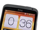
The 720p camera at the front enables video-chatting
Underneath the screen, we find the three controls typical of Android 4.0 ICS which, in the HTC tradition, come in capacitive flavor. The haptic enabled Back, Home and Task switcher keys are well spaced and very responsive. We've been over this already - while ICS dictates on-screen controls, the latest Sense UI requires actual Back and Home buttons.

There are three capacitive buttons underneath the screen
The left side of the HTC One X features the microUSB port, which is used for data transfers, charging and, thanks to its MHL support, TV-out. With an MHL adapter you'll be able to output 1080p content to your HDTV directly from your phone, so purchasing one is probably worth it.

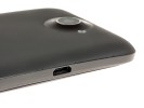
The MHL-enabled microUSB port is on the left
On the right side we find nothing but the super slim volume rocker. With all the fuss HTC made about the One X camera, you would be forgiven for expecting to find a shutter key here, but there is no such thing.
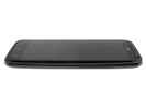
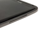
The volume rocker is placed on the left side
At the top we find the 3.5mm audio jack, a microphone pinhole and the Power/Lock key, which is easy enough to hit when needed but still reasonably secure against accidental presses. The microSIM slot is located nearby at the sloping part of the phone's rear body. You need to insert the SIM eject tool located in the retail box or a pin inside the hole next to the slot to access the microSIM tray.


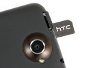
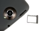
The power button, the 3.5 mm audio jack and the microSIM slot are on top
As usual, at the bottom of the phone, you will see the mouthpiece.
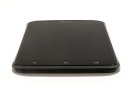
The second microphone pinhole is all you get at the bottom
The back of the HTC One X features the 8MP camera lens and the LED flash right next to it. The camera lens is placed on a bulge and the protective glass may get scratched by surfaces it comes in contact with.
The other elements at the back are the loudspeaker grille near the bottom and the Beats audio logo right above it. You should keep in mind though that the audio enhancements are only available when you have connected a pair of headphones and not when using the loudspeaker itself.

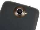

The 8 megapixel camera is joined by the LED flash and the loudspeaker grille at the back
It was a relief to find out that the HTC One X has none of the death grip issues of its metal-clad predecessors. We suspect that was one of the main reasons why HTC went with polycarbonate this time around. As Nokia made a point about the N9 - a phone with so many antennas simply can't perform properly with a metal unibody.
The HTC One X is powered by a non-user-replaceable 1800 Li-Ion battery. HTC didn't provide official endurance ratings for it, but our experience showed that it's a pretty decent performer. Despite the large high-res screen we were always able to get a full day of heavy usage without recharging and sometimes even a day and a half.
We'll be doing a detailed battery test of the HTC One X over the following few days and we'll update the review with the results, so stay tuned.
In conclusion, we cannot overstate how impressed we are with the HTC One X's design and build. The smartphone feels really great in hand. The commendable ergonomics and smart use of space go a long way to convince us that a 4.7" smartphone can actually be a popular choice.

Sense 4.0 on top of Android 4.0 ICS just makes sense
The HTC One X, just like the HTS One S, comes with Android 4.0.3 and Sense 4.0 - both the latest and greatest Google and HTC have to offer. We've already seen those in action on the One S, but One X offers even smoother performance and higher resolution. There are no surprises though, nothing exclusive on the One X that is not present on the One S as well. Still we are going to explore the Android/Sense combo once again for you.
You've already heard about the new screen - it's really awesome and the OS and the Sense UI look even better on its HD resolution than on the One S qHD. The One X offers probably the best smartphone experience up to date - both visual and functional.
Here's a demo video to get you started:
HTC are famous for their deep customizations of the interface of the host OS and the latest version of Sense is no exception, though the Taiwanese have taken user feedback to heart and worked hard to provide a much more unobtrusive experience.
The brilliant lockscreen has been further improved, sealing its position as the most functional, most customizable lockscreen on a smartphone. By default, it has four shortcuts and a ring at the bottom. You drag the ring towards the center of the screen to unlock the phone.
Or, you can drag any of the shortcuts into the ring to unlock the phone and launch the corresponding app. You can assign any four apps to the lockscreen.
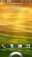

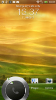
The new lockscreen is brilliant
But that's not the end of it - the HTC One X comes with eight different lockscreens preinstalled. You can access the others from the Personalize menu.
You get all the old ones - a photo album, Friend Stream, Weather, clock and stocks.
There are two new additions though and they're much more functional. The first is called Productivity and lists the latest missed calls, texts, emails and scheduled events.
The second one is People - you pick a group form your phonebook and a rectangular grid of their contact images will pop up on the lockscreen. Grab one of them and drop them on the ring to view their details. You can have more than one page of contacts too.
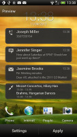
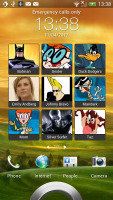
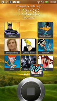
The two new preloaded lockscreens
If you're using the music player, the playback controls show up on the lockscreen (as usual), and you can drag that onto the ring to jump straight into the music player too.
Unfortunately, you can't download new lockscreens off the HTC Hub.
HTC have done a lot to streamline the lockscreen and the same goes for the homescreen. Gone is the scrolling indicator arc, gone is the three button dock that wasn't very useful.
You get an auto-hiding indicator of which screen you're on and a brand new dock with five shortcuts - the middle one is locked to the app drawer, while the other four can be customized as you please (you can even put a folder there, if four shortcuts isn't enough).
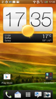
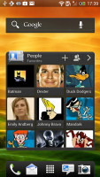
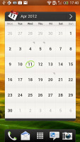
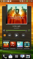
Some of the homescreen sections
Leap view is still here - tap the home key (while on the default homescreen) or do a pinch gesture to zoom out (with an awesome animation) to display the thumbnails of all seven homescreen panes at once. Upon a press and hold you can drag to reposition the homescreen panes. A small "home" icon indicates the default homescreen.
You can have as many as seven homescreens - and with all the excellent preloaded widgets, you might want to keep all of them.
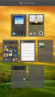
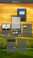
Leap View lets you quickly rearrange homescreen panes
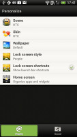
One of the biggest complaints was that the Personalize button was just taking up space in the dock at the bottom of the screen. And it was - it has since been moved to the app drawer, but it still offers plenty of customization options.
The proprietary Scenes is one of them - essentially five custom homescreen setups (Work, Travel, Social, Play and default). Each scene changes the wallpaper and the set of widgets. For instance, the Work scene has a Stocks widget, while the Social offers a Twitter widget. Those can be customized, of course, and you can download new ones.
Switching between scenes takes a couple of seconds, but they're a handy feature if you use your One X as both work and personal phone.
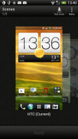
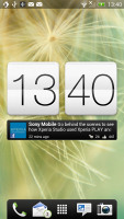
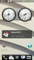
Preset scenes • The scenes in action
The HTC Sense has another customization option called Skins. Every skin changes the look and feel of most of the onscreen buttons, application screens, option menus, and other items. They also come with unique wallpaper each and use different colors for various UI elements.
The main menu has the typical grid layout, which is composed of horizontal pages with shortcuts sorted alphabetically. You can set different sorting options - alphabetical, most recent or oldest - but you can't rearrange them manually. There are Search and Play Store shortcuts along with a menu for some options.
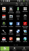
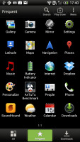
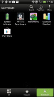

The new app drawer
The main menu has a tabbed layout similar to different Sense elements (such as the phonebook). There are three tabs available at the bottom - All apps, Frequent and Downloads. You can rearrange them or remove Frequent and Downloads if you don't need them.
The Personalize app also has Sound customizations - you can pick a Sound set or individual ringtone, notification and alarm sounds.
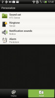
The Personalize menu does Sound too
Adding widgets to the homescreen is done in similar fashion to Honeycomb and is one of the less successful changes.
You press and hold on the homescreen and everything zooms out so that the homescreen panes are visible as thumbnails on the top row of the screen. You tap a homescreen to select it and then select a widget to add to it (or you can just drag the widget).
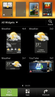
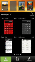
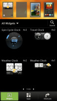
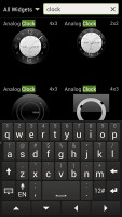
Adding a widget to the homescreen
Our beef is with how widgets are selected - they are shown four at a time and there's a lot of scrolling involved. Widgets are available in multiple versions - usually differing in size, but also functionality - and they're all dumped into the list, so you're scrolling through a lot of duplicates.
There's a search option to speed things along or you can choose a widget from the dropdown menu and then select which size you like, but that still feels like an extra step.
The old setup of picking a widget and then picking the size (if any) seemed simpler.
Editing the homescreen is different from vanilla Android. You can tap and hold on a widget and you can drag across homescreen panes. While you're dragging a widget (or shortcut or whatever), two "buttons" appear at the top of the screen - Edit and Remove. You drop the widget on either button to perform the corresponding action.
Edit can be used to modify the settings of a widget - e.g. choose a different folder for the Photo Frame album or even choose a different version of the Clock widget. This saves you the trouble of first deleting a widget and then putting it on the screen again to choose a different version, setting and so on.
The second "button" is Remove, which deletes the widget as expected.
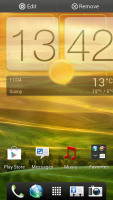
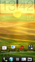
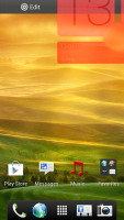
Dragging a widget gives you options
The notification area no longer has the list of recent apps - it's all available to notifications only. No more tabs and toggles either - you get a Settings shortcut here if you need to power something on or off. There's also a Clear button to dismiss all notification or you can swipe them off one by one.


The notification area has been significantly de-cluttered
HTC have remodeled the app switching interface - screenshots are displayed of the running apps, turned slightly to the side. They're ordered horizontally (instead of vertically as is the ICS standard) and you can swipe up to remove them. The not so-good news is that you can only see three of them at a time, even in landscape mode - a waste of screen estate.
You get the old task manager too. It's simple to use - each running app is listed with an indication of how much RAM it's using (no CPU usage reading though). You can terminate apps one by one and there's a Kill All button too.
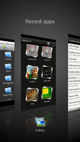
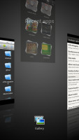
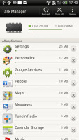
HTC's task switcher and task manager
Synthetic benchmarks
If you already read our HTC One S review you already know what to expect here. The Terga 3 chipset, despite being a quad-core one, is based on the older, Cortex-A9, architecture, so it's not dramatically faster than the latest generation dual-core Krait processors. What's more, on some benchmarks Tegra 3 lagged behind the Snapdragon S4.
Oddly enough, single-threaded performance wasn't that different as Benchmark Pi shows, but Linpack tested in multi-threaded mode showed that two Krait cores outdo the Tegra 3 quartet. Still, the One X CPU provides plenty of power and chances are you won't be feeling limited by it in the near future.
Benchmark Pi
Lower is better
- Sort by Label
- Sort by Value
- HTC One X338
- HTC One S306
- Samsung Galaxy S II452
- Samsung Galaxy Nexus408
- HTC Sensation XE536
- Sony Xperia S536
- Samsung Galaxy Note 10.1351
Linpack
Higher is better
- Sort by Label
- Sort by Value
- HTC One X126.1
- HTC One S210
- Samsung Galaxy S II77.6
- Samsung Galaxy Nexus77.1
- HTC Sensation XE50.4
- Sony Xperia S86.4
- Samsung Galaxy Note 10.190
The 3D graphics department is handled by NVIDIA's own GeForce GPU. On the HD screen of the One X it did 47+ fps, while the Adreno 25 inside the One S does 60 fps but on a qHD display, which has just 33% fewer pixels. This means the ULP GeForce GPU does better than the Adreno 225 in terms of pure power.
NenaMark 2
Higher is better
- Sort by Label
- Sort by Value
- HTC One X47.5
- HTC One S60.5
- Samsung Galaxy S II51.6
- Samsung Galaxy Nexus24
- HTC Sensation XE23
- Sony Xperia S37.5
- Samsung Galaxy Note 10.143.6
On SunSpider, the CPU-stressing JavaScript benchmark, the HTC One X posted a blazing fast result, beating all competitors but the One S. The HTML5 test, BrowserMark, however shows that HTC has some more work to do as the One X lost to an ICS-running Galaxy S II by about 10% (and the S II CPU has fewer cores andlower clock speed).
SunSpider
Lower is better
- Sort by Label
- Sort by Value
- HTC One X1757
- HTC One S1708
- Samsung Galaxy S II1849
- Samsung Galaxy Nexus1863
- HTC Sensation XE4404
- Sony Xperia S2587
- Samsung Galaxy Note 10.11891
- Apple iPhone 4S2217
BrowserMark
Higher is better
- Sort by Label
- Sort by Value
- HTC One X96803
- HTC One S98435
- Samsung Galaxy S II111853
- Samsung Galaxy Nexus103591
- HTC Sensation XE72498
- Sony Xperia S74990
- Samsung Galaxy Note 10.1113256
- Apple iPhone 4S88725
Great social phonebook
The One X has HTC's all-knowing phonebook with deep social networking integration. It manages to keep things neatly in order, even though it's juggling everything from SMS to Facebook photo albums.
The entire People app (the phonebook) is tabbed - you have the dialer, all contacts, groups (including favorite contacts there), as well as a call log. Once again, you can reorder tabs and remove the ones that you don't need (Groups or Call history).
From a drop-down menu at the top, you can filter contacts based on where they came from - the phone's address book, Facebook, Twitter or your HTC Sense account. If an account has multiple subgroups (e.g. Gmail's groups), they can be toggled individually as well.

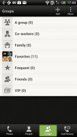

Phonebook • groups • call log
Selecting a contact displays the basic details: name and photo, numbers, emails and such. That's just the first tab - the other tabs hold further details and means of communication, including email and a call log.


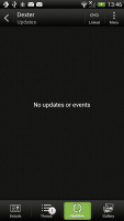
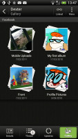
Viewing a contact
The second tab holds the texts, emails and call history between you and the given contact. The next one displays social networking contact updates, and the fourth one called "Gallery" pulls the albums that contacts have created on Flickr and Facebook.
When editing a contact, you start off with just one of the essential fields but you can easily add more.

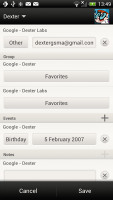

Editing a contact • Linking Dexter with his Facebook account
The transfer app is here to help you switch from your old phone. It supports many phones from major manufacturers and moves the data over Bluetooth. It's an old, but useful trick.

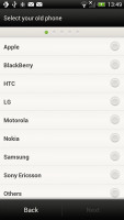
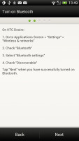
The Transfer app will easily copy your contacts from your old phone
Telephony
The HTC One X had no problems with reception and the in-call quality was clear and loud enough. There is no 3G video call support out of the box though, you have to install a third party app.
The dialer on the One X displays your recent calls and the list of favorite contacts underneath. Once you start typing on the keyboard, contacts will be filtered by name or by phone number.
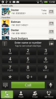
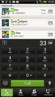

The dialer has smart dialing • calling Dexter
The One X packs the standard set of accelerometer-based tricks - turning the phone in the middle of a call will enable the loudspeaker, Quiet ring on pickup will reduce the loudness of the ringtone when you move the phone and Pocket mode boosts ringtone volume if the phone is in your pocket or purse.
Here's how the HTC One X fares in our traditional loudspeaker performance test. It scored an Average mark placing just below the halfway point of our ranking and right alongside its One S sibling.
| Speakerphone test | Voice, dB | Pink noise/ Music, dB | Ringing phone, dB | Overal score |
| Samsung I9000 Galaxy S | 66.6 | 65.9 | 66.6 | Below Average |
| Sony Xperia S | 72.7 | 61.8 | 69.6 | Average |
| HTC One S | 65.1 | 64.6 | 76.7 | Average |
| HTC One X | 65.1 | 66.0 | 75.8 | Average |
| Samsung I9070 Galaxy S Advance | 74.2 | 66.5 | 75.7 | Good |
| HTC Titan | 75.8 | 66.2 | 82.7 | Very Good |
| HTC Desire | 76.6 | 75.7 | 84.6 | Excellent |
Messaging
Android and the HTC One X are capable of handling all sorts of messages - SMS, MMS, email. Social networking is covered by several apps and widgets, and there's Gtalk, which can connect you to Google's chat network and compatible networks too (like Ovi Chat).
SMS and MMS messages are displayed in threads - you see a list of all conversations, each one is listed with the contact's photo, name and the subject of the last message, as well as a part of the actual message (you can choose 1, 2 or 3 preview lines). Tapping a conversation brings up the entire message history with that contact.
To add recipients, just start typing a name or number and choose from the contacts offered - the phone will find the contact you want even if you misspell it (e.g. "drx" matches Dexter).


All threads • viewing a specific thread • Adding recipients works even if you misspell the contact's name
The compose box covers about a fifth of the screen in portrait mode or about a third in landscape. A tap-and-hold on the text box gives you access to functions such as cut, copy and paste. You are free to paste the copied text across applications like email, notes, chats, etc. and vice versa.
Text input on the One X boils down to an on-screen custom-made HTC virtual QWERTY keyboard. While it's still not as good as a hardware one, it's the next best thing - the 4.7" screen has enough real estate for big, well-spaced keys, which are easy to hit.

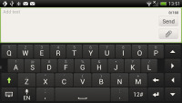
The on-screen QWERTY keyboard in portrait and landscape modes
Converting SMS into MMS is as simple as adding some multimedia content to the message. You can just add a photo or an audio file to go with the text, or you can get creative with several slides and photos.
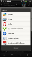
Attaching a multimedia file turns the SMS to MMS
Two email clients
The HTC One X comes with two email apps - the traditional Gmail app and the generic HTC Mail app, which merges all your email accounts into a single inbox.


Batch operations lets you manage multiple conversations
The Gmail app has the trademark conversation style view and can manage multiple Gmail accounts. Batch operations are supported too, in case you need to handle email messages in bulk.
The HTC Mail app features conversation view in an attempt to mimic the original Gmail client threaded view, which is otherwise missing in the generic inbox. Emails in a thread are grouped and a number of emails and a down arrow appear - tap the arrow to show/hide the messages in that group.
You can add multiple accounts (from multiple services) and view them individually or in a combined inbox. Each account is color coded, so you can quickly associate each message with its relevant account.



The standard HTC email app
The Mail app has tabs, but they are hidden by default. You can choose Edit tabs from the menu and pull out the ones you want. You can choose from Favorites, Unread, Marked, Invites and Attached.
Email sorting is enabled (in either ascending or descending order) by date, subject, sender, priority and size. The currently applied filter is displayed in the top right corner of the display.
There's hardly anything we can think of that the HTC One X lacks in terms of email capabilities. The settings for popular email services are automatically configured. POP/IMAP accounts and Active Sync accounts are supported.This post sponsored by: Dr Mobiles Limited
1 Huron Street, Takapuna, North Shore 0622
Tel: (09) 551-5344 and Mob: (021) 264-0000
Web - Map - Google+ - Email - Posterous - Tumblr - Twitter - Blogger - Flickr - Author